Kwong Bee
Rebranding & Packaging Design
Kwong Bee is a local Cebuano brand that is famous for their well-loved Chinese-style pork sausage. Since the 1950's, Kwong Bee's special pork sausage, which is smoked, sweetened and seasoned, has been a staple in many popular Filipino and Chinese dishes including pancit canton, fried rice, and more.
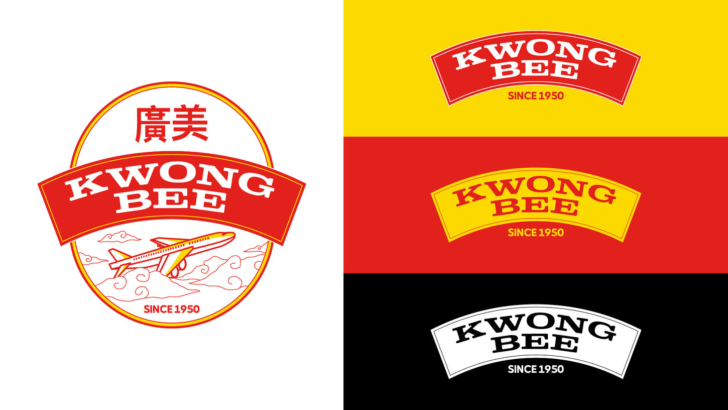
Kwong Bee wanted to update the look and feel of their branding and packaging while still retaining the airplane image and the red and yellow colors. The team took inspiration from Chinese themes to create a fun and more playful version of the logo and make the brand look fresh and new. The simple, compact emblem-type with the plane image and striking typeface was designed to make the logo easy to apply on different materials and collaterals, especially packaging.
To make the packaging stand out in the aisles but still maintain the same Kwong Bee feel that customers know and love, the photography made use of actual serving suggestions - how Kwong Bee is enjoyed by Filipinos as a main ingredient in all-time favorite dishes.


