Tops
Branding and Visual Identity
Perched high above Cebu City, Tops Cebu has long been a cherished destination — a go-to for breathtaking panoramic views, cool mountain air, and golden sunsets. While it has maintained its status as a local favorite for decades, the brand was in need of a visual refresh that would match its major redesign. The revitalized destination features expanded viewing spaces, a variety of restaurants and event spaces, and modern amenities, all while retaining its historical arches and hexagonal flooring.
The challenge was to rebrand a well-loved Cebu destination. The logo typography is custom-made, with subtle flourishes at the end of each letter. The curves reflect the panoramic views and winding roads that Tops is known for.
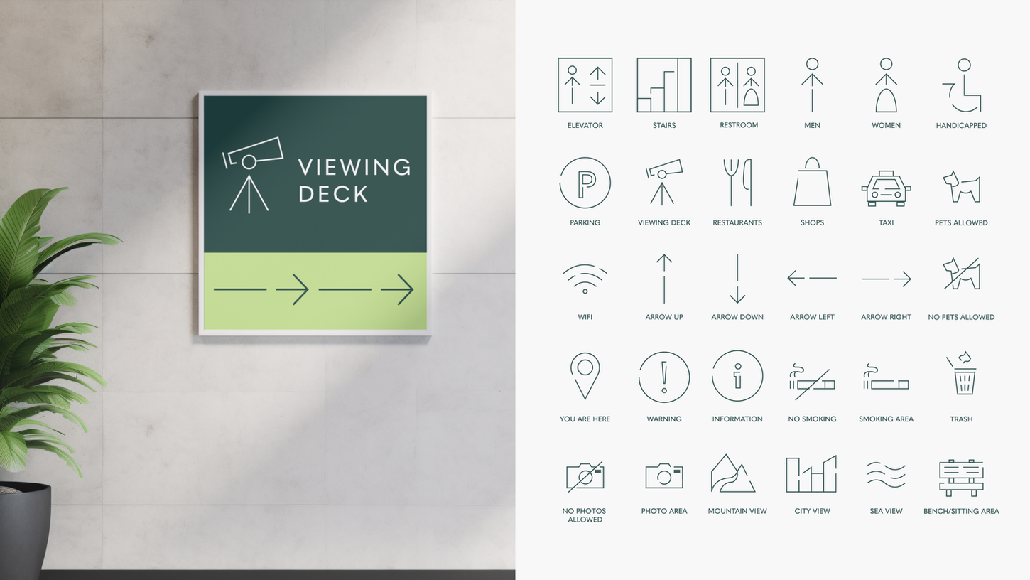
The lines are thin, and the elements are spaced in a way to communicate lightness and openness. Overall, the forms are modern and clean, a touch of refinement that's fitting for Tops' new look and feel.


